Indesign Projects
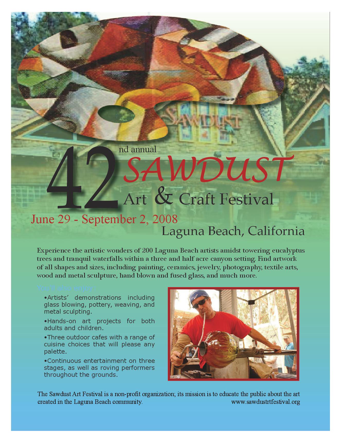
Click the image for the full-size graphic. I wanted my final design to seem somewhat abstract and bright because the event was taking place in the summer.
I also wanted to include an image of an artist working at the festival to showcase something that might be seen.
I chose to use the sawdust wood lodge in the background and gradient feather it to get a nice image of the building and area the event would be taking place in.
I played around a bit with the character and paragraph styles to make sure that the text would pop and kept it a simple black and used the red from the Sawdust logo so that
it would be easy to read and not too colorful to where it was overwhelming. Also to keep with the art and abstract theme I chose to use a paint pallet and use a clipping path
with an abstract painting to a) get the viewer’s attention and b) be easily recognizable as an arts festival even at a quick glance. I used the gradient feather to add some
color and keep the ad from looking too dark and to just make it fun.
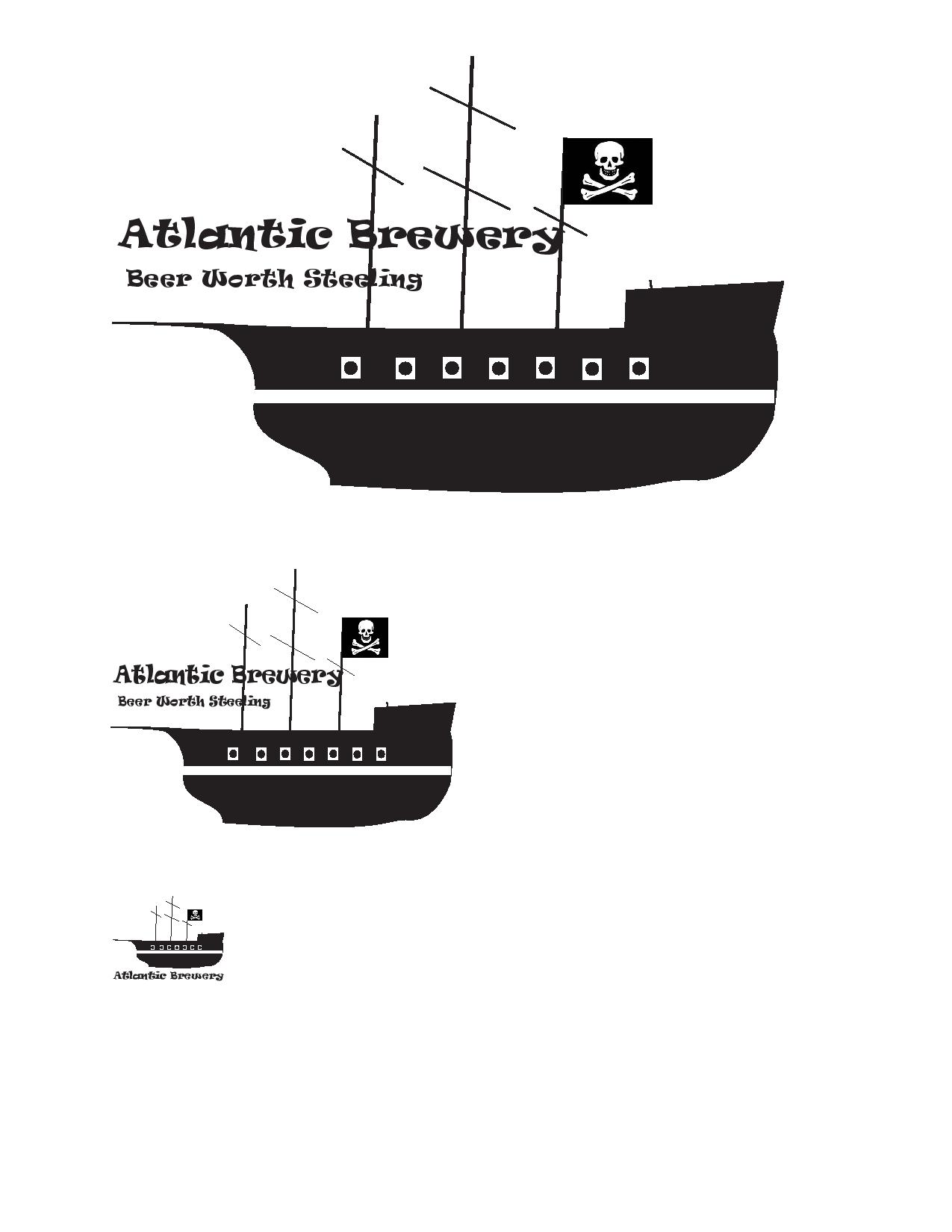
Click the image for the full-size graphic. This was one of the first projects that I completed for the class.
I chose to create a pirate ship with simple text because of its history in the Charleston area and because I wanted to see if I could do it in Indesign.
To do this I used the polygon tool to make a 5 sided figure and then used the direct selection tool to place the corners where I wanted them.
Once that was done I used the pen tool to add anchor points and the change direction tool to create the curves seen on the ship.
I wanted the ship to be easily recognizable as a pirate ship so I used the classic skull and crossbones flag to signify that it was a pirate ship.
The masts were then created using the line tool. I wanted the finished product to be simplistic yet appealing and I think I pulled this off with simple curves and an easily identifiable graphic.
When reducing the size of the image to 1” I decided that it would be beneficial to remove the slogan all together and move the company
title to below the ship so that it would be easier to read. I thought that this image as a whole would be appealing because of the notorious
history of pirates and the company being based in an area that, many years ago, dealt with pirates regularly.
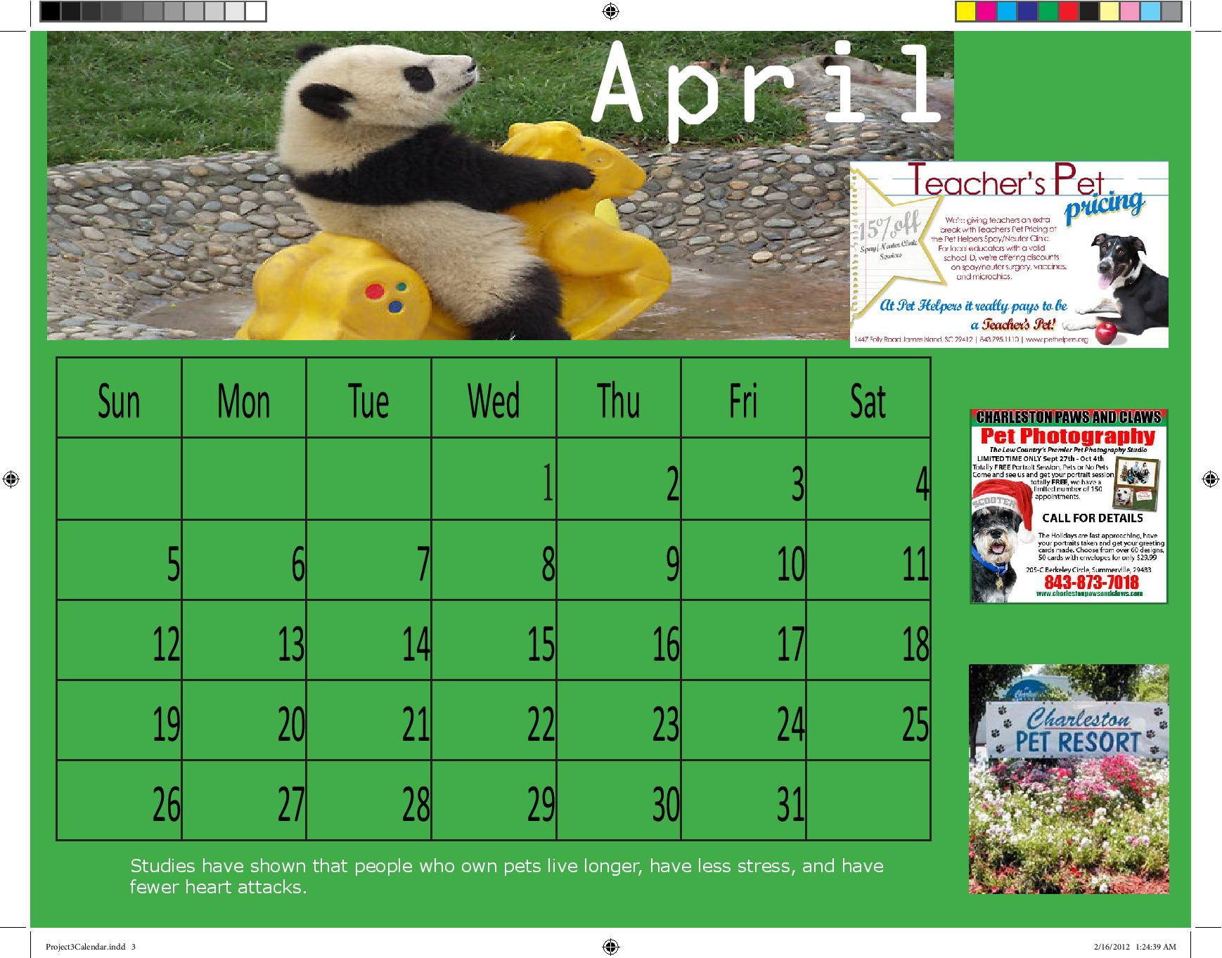
Click the image for the full-size graphic. This was one of my last graphic design projects for the class before moving on to website publishing.
The assignment was to make a calendar for the Humane Society using cute animals and also to place ads for local businesses on the calendar.
We were tasked with using master pages in Indesign to create the layout and to tweak the smaller details as the months changed. To do this I set up the basic page layout using the A-Master page
and then used design principles to meet the requirements of the project.